

Year: 2018 Role: Designer Client:
Project Overview
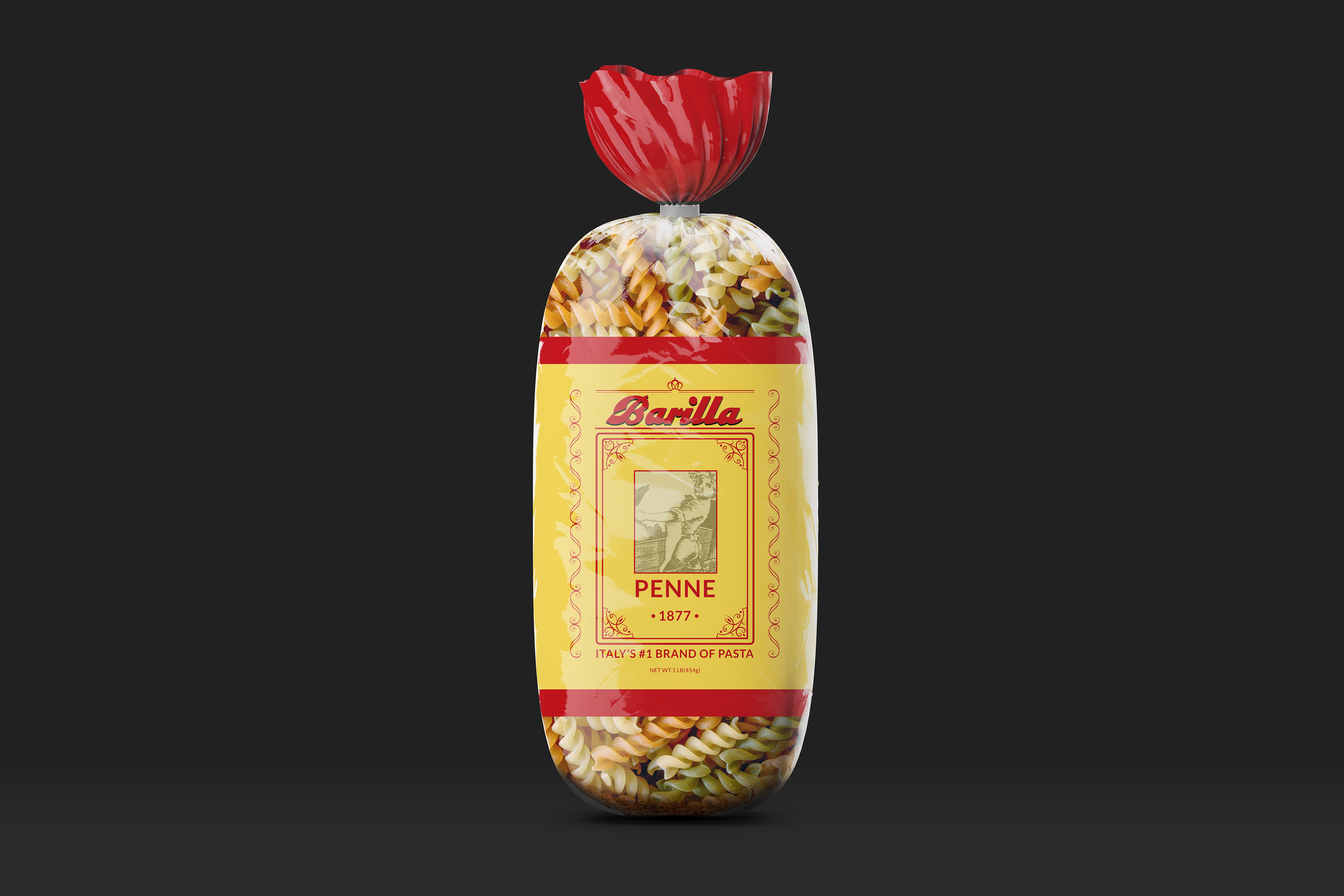
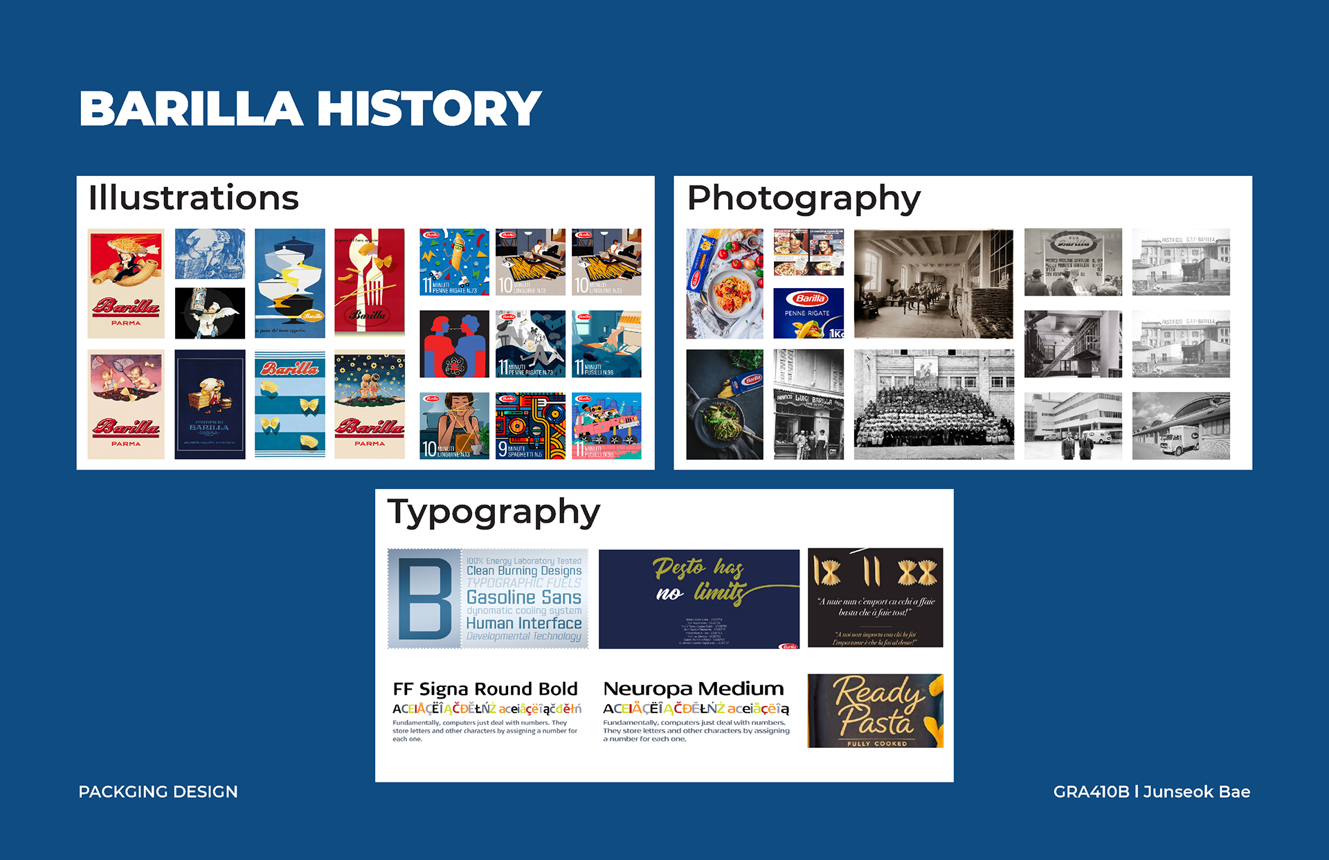
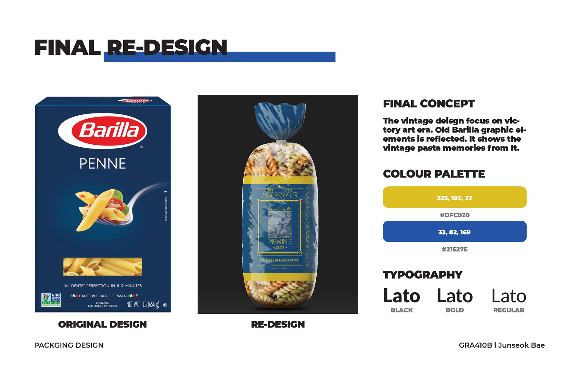
This project is a vintage-inspired redesign of the Barilla pasta packaging, blending historical aesthetics with modern functionality. The design reinterprets Barilla’s heritage by incorporating classic graphic elements from past eras while maintaining the brand’s premium identity.
Concept & Approach
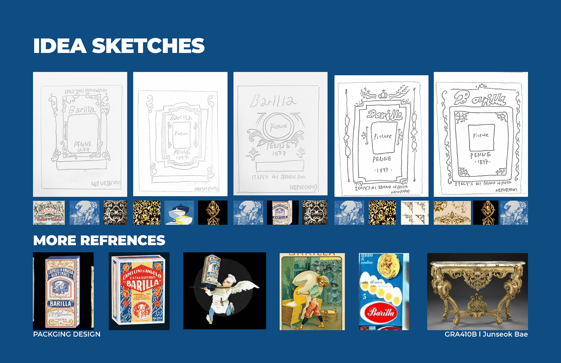
• Inspired by the Victory Art Era – The packaging design reflects historical influences, bringing a nostalgic yet elegant touch to the product.
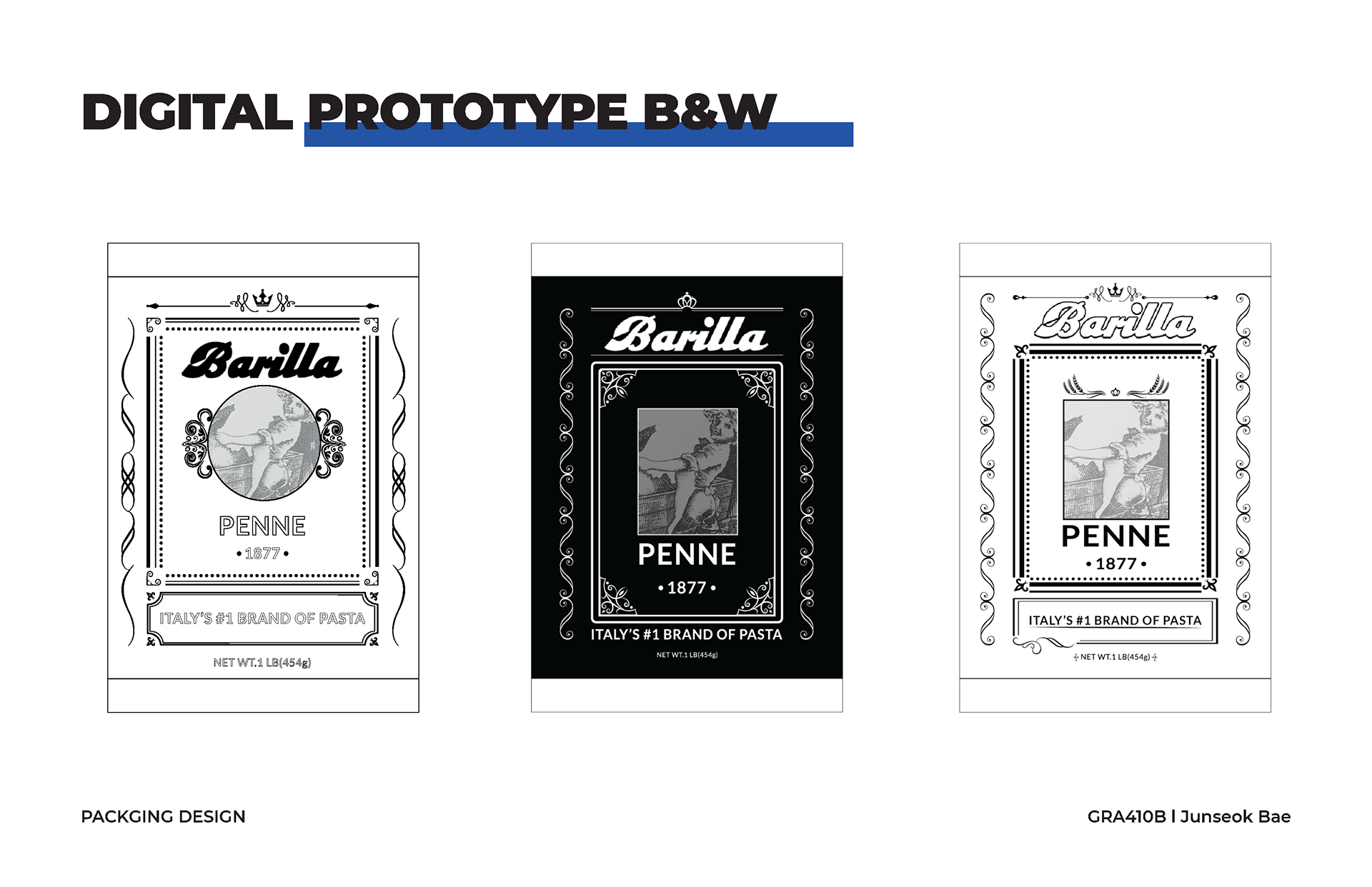
• Reviving Classic Barilla Graphics – Vintage design elements are reintroduced to celebrate the brand’s rich history.
• Emphasizing Pasta Tradition – The new packaging evokes memories of traditional Italian pasta culture, enhancing the consumer experience.
Key Design Elements
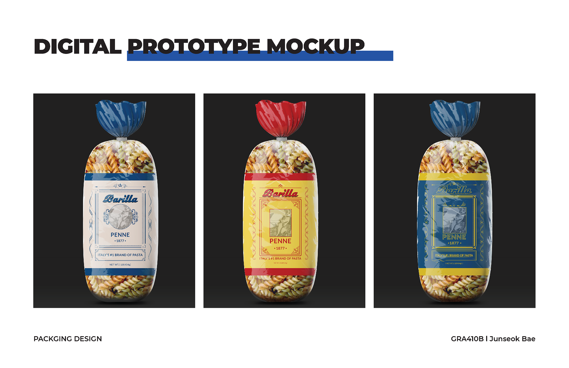
• Colour Palette: A sophisticated combination of deep blue (#21527E) and golden yellow (#DFC020), reinforcing a premium vintage feel.
• Typography: The Lato font family (Black, Bold, Regular) is used to ensure clarity and consistency.
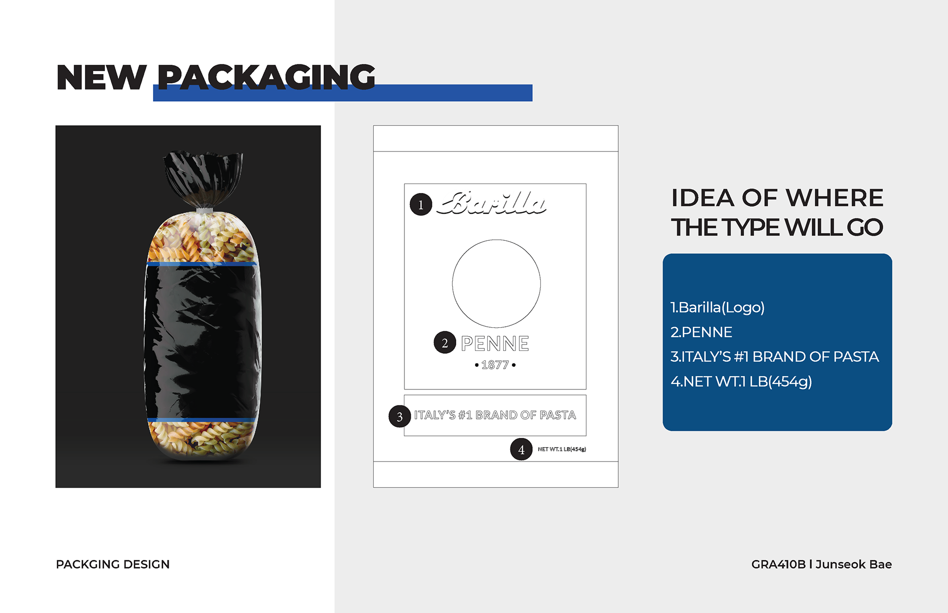
• Redesigned Packaging Format: Moving from a standard box format to a sealed transparent bag, creating a more artisanal and authentic visual appeal.
Final Outcome
This redesign successfully merges Barilla’s historic essence with a contemporary vintage look, making the packaging stand out while preserving brand recognition.


WORK PROCESS


Software
Adobe Photoshop, Adobe Illustrator, Adobe InDesign
Adobe Photoshop, Adobe Illustrator, Adobe InDesign